
Basic techniques of button design
Share

Make buttons look like buttons.
One of the most essential thing of the user interface is users need to know instantly what is "clickable" and what's not. Create the buttons by using appropriate visual signifiers (such as size, shape, color, shadow, etc.) to make the element look like a button. PLEASE DO NOT ASSUME THAT YOUR UI IS ALREADY OBVIOUS FOR YOUR USERS. In many cases, designers intentionally don't identify buttons as interactive elements because they assume the interactive elements are obvious for users. When designing an interface, you should always keep in mind that "Your ability to interpret clickability signifiers aren't the same as your users' because you know what each element in your design is intended to do."
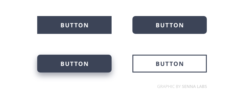
Use familiar designs for your buttons
Here are a few examples of buttons that are familiar to most users :
- Solid button with square borders
- Solid button with round corners
- Solid button with shadows.
- Ghost button
Don't play hunt-the-button game with your users
Buttons should be located in places where users can easily find them or expect to see. If users can't find a button, they won't know that it exists. Test your design on discoverability. When users first navigate to a page that contains some actions that you want them to take, it should be easy to spot an appropriate button for the user.
Label buttons with what they do
Buttons with generic or misleading labels can be a huge source of frustrations for your users.
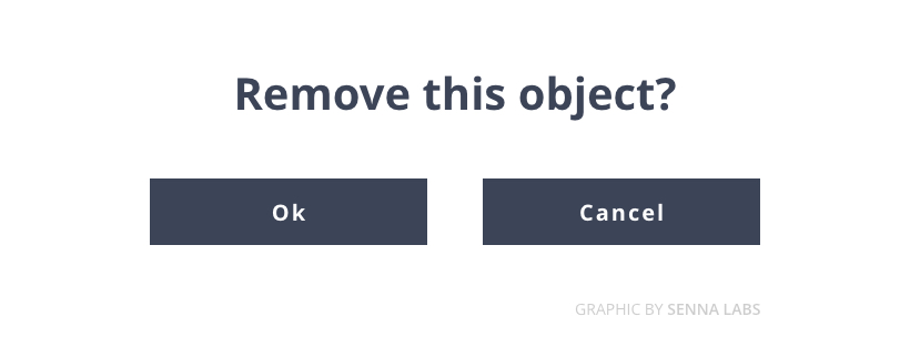
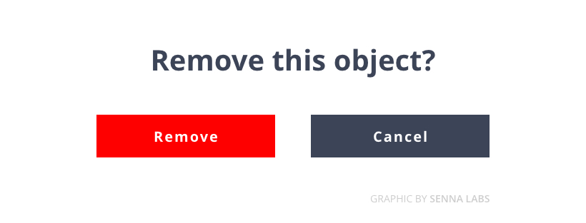
Users should clearly understand what happens when they click on a button. Let see a simple example, Imagine that you accidentally triggered a remove action, and now you see the following error message.
It's not clear what does "Ok" and "Cancel" represent in this dialog. Most users will ask themselves, "What happens when I click on "Cancel"?Instead of using "Ok" label, it's better to use "Remove." This will make it clear what this button does for the user. Also, if the button is a potentially dangerous operation, you can use red color to state this fact.
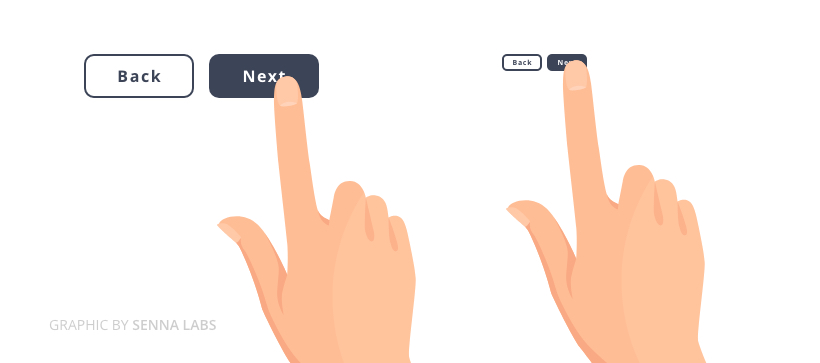
Proper size for your buttons
Button size should reflect the priority of this element on the screen. A large button means more important action and it's important to make the buttons finger-friendly for mobile users.
Avoid using too many buttons
This is a common problem for many apps and websites. When you provide too many options, your users end up doing nothing.
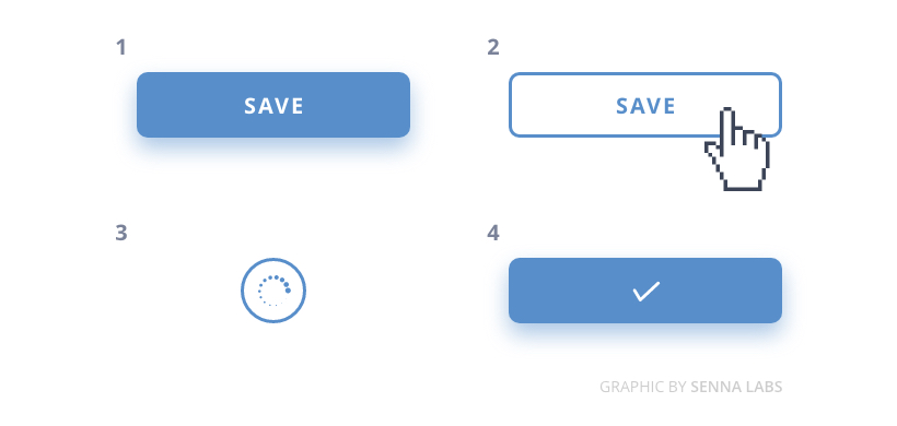
Last but not least, provide visual or audio feedback on the interaction
When users click or tap on the button, they expect that the user interface will respond with appropriate feedback. Based on the type of operation, this might be either visual or audio feedback. When users don't have any feedback, they might consider that the system didn't receive their command and will repeat the action. Such behavior often causes multiple unnecessary operations.
Why is this happening? As humans, we expect some feedback after we interact with an object. It might be visual, audio, or tactile feedback, anything that acknowledges the fact that interaction was registered.
If you find this interesting, don't forget to subscribe to get the latest articles or check out all Design articles here.
Thank you information from https://uxplanet.org/7-basic-rules-for-button-design-63dcdf5676b4

Share

Keep me postedto follow product news, latest in technology, solutions, and updates
Beyond the Labs
Explore all


Let's build digital products that are simply awesome!
Let's build digital products that are simply awesome!